Fields
Fields
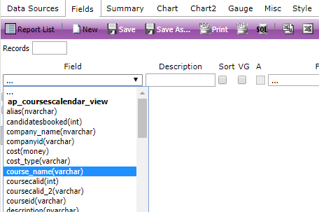
Once you have added in at least one Data Source, you can move to the Fields tab.This page contains a lot more functionality than the Data Sources tab as the Fields can be manipulated a lot more. You’ll find you spend most of your time within the Fields tab when you are building a Report.
You can add any fields that are available within the Data Sources you've currently selected for your Report.
Bear in mind that you are able to go back to the Data Sources tab at any point while building your Report so don’t worry if you’re missing anything at this stage.
You might notice that some of the fields you add, upon previewing the report, show up as numbers (what we call Constant Values) as opposed to the text you want to show. This is due to how the data is stored in the database, however you can use the Advanced Field Settings to replace these numbers with the corresponding text.
To replace the numbers with text, follow these steps:
Find the field you need to alter.
Click on the cog symbol on the right of the field row to go to Advanced Field Settings.
In the Value Ranges field, you should enter what each number means in text. For example, if you are using the status(int) field in coursescalendar, this is the Course Date Status field on the system, and the Value Range field should be:
0:Unknown;1:Cancelled;2:Completed;4:Fully Booked;8:In Progress;16:Available;32:On Hold;64:Provisional;512:FailedClick OK.
Please contact the Support team if you wish to know a list of the Constant Values for your report.
Organising your report columns
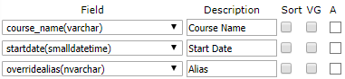
There are three tick boxes available beside each Field, ‘Sort’, ‘VG’ & ‘A’:
Sort: The sort tick box will order your Report by that Field, for numerical Fields this will be from null to 0 to 9 and onwards, dates Fields will be ordered earliest first, others will be alphabetical. This would be useful if you were building a Report of yearly income per course and wished to order your courses by highest to lowest revenue. It may also be useful if you were building a Report which would list all the candidates for a specific course date, you could order them by date booked, by surname, or by Account name.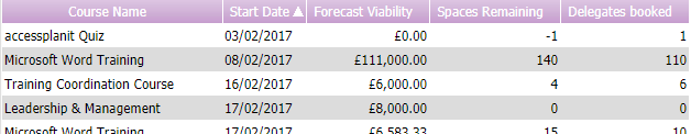
VG: VG is Visually Group. Ticking this box against a Field will essentially turn this Field into a header for the rest of the Fields grouping the results of the Report by the output of this Field. This is commonly used when looking at course date information as rather than listing the name of the course each time a course date is listed in the Report, it would make sense to visually group by course name.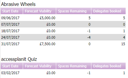
You can visually group multiple Fields in one Report. For example, when listing candidates and their details for specific course dates in the future you may want to visually group by course name and start date of the course.
A: The A tick box is used for performing arithmetic functions within the Report Writer. There are the four simple maths functions available: addition (+), subtraction (-), multiplication (*) and divide (÷). To use this tick box, ensure you have the two Fields you’d like to perform the function on together (i.e. one of the Fields is directly below the other) then click the tick box on the lower Field of the two until you have the correct symbol showing. This function is commonly used to calculate the NET value on Invoices. To do this you would need the Invoice amount Field followed by the Invoice tax Field. You would then click the A box until you had the ‘–‘. You can then Preview the Report to see the outcome: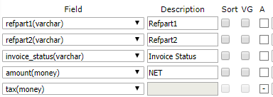
You can also use this tick box on non-numeric Fields. For non-numeric Fields ticking this will join the Field and the one above it together. This is commonly used for joining Users’ forenames and surnames together into one ‘name’ Field (Jane, Smith becomes Jane Smith), or Invoice ref part one and Invoice ref part 2 (inv, 3002 becomes inv3002):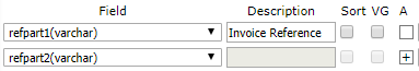
Performing Functions within Report Writer
You can perform a number of functions on the Fields you select in your Reports. The functions available depend on the Field you have selected.
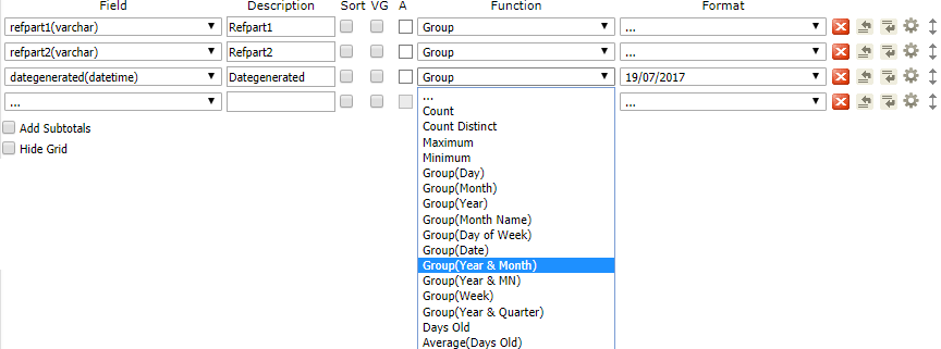
For example, in the below image you can see there are a lot of date options i.e. group by month name, group by week. This means the Field in question must be a date Field, otherwise we wouldn’t be able to group the results of the Report by its year or date.
The most commonly used functions are count, sum and days old.
Count: Selecting count will group the rest of the Fields together, then the number of results from this Field will be counted and the number will be displayed on the Report. For example, if you wanted to know the number of candidates listed on a course date, you would include the course name, the start date of the course date, and then add a Field for usercoursecalid (the unique identifier for candidates) – and add a count function on this Field.
Sum: Sum will total up all the results. An example of where sum could be used would be in a Report to show income per customer, we would use the companies Data Source to list all the companies in accessplanit – join this to the Invoices Data Source (targetid rather than companyid see Selecting Data Sources above), then add the ‘amount’ from the Invoices table. Without using the SUM function, each amount from each Invoice would be listed respectively in the Report, once we add the SUM function to the Field, all the individual amounts will be totaled and listed against the company name.
Days old: Days old is used to group results based on their age in accessplanit, for example in a ‘This Week’s Bookings’ Report grouping all bookings in the platform by how many days ago they happened, or a ‘New Companies’ Report, grouping together all the companies which were added into the platform recently by how many days ago that was.
Adding a Pivot
To create a Pivot as part of your report, follow the below steps:
- Once the Data Sources have been chosen, move to the fields tab.
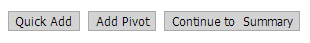
- To create a pivot in the report, click the ‘Add Pivot’ button below the field selection area.
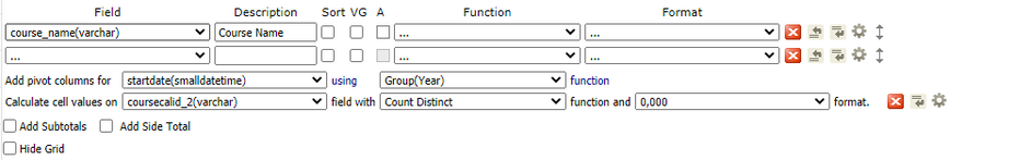
- Within the pivot options, select the field which you are creating columns for, and the field which will be populating within the resulting grid.
- In the example below, the course name field from the courses table is used to create a column listing each of the course names.
- The pivot table will have a column for course start date grouped by year and the values of the report will be a count of each course date reference (coursecalid).
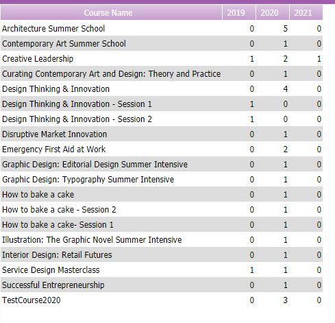
- When previewed, the report appears like so:
Splitting Pivot Table Columns
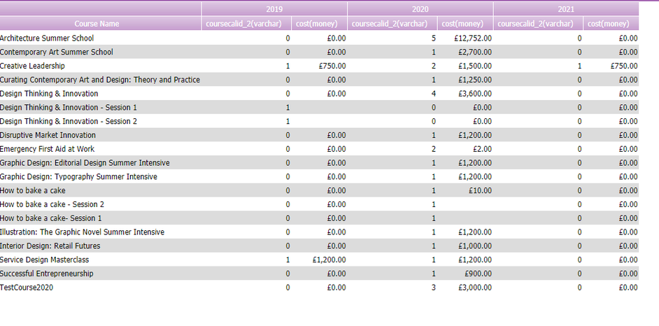
Further columns can be added to a Pivot Table to allow further information to be shown.
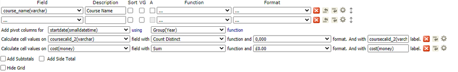
Continuing with the earlier example, adding a further column to show the total cost of the course dates for that year.
Advanced Field Settings
At the end of each Field's row in the Fields tab, you will see a Settings cog.
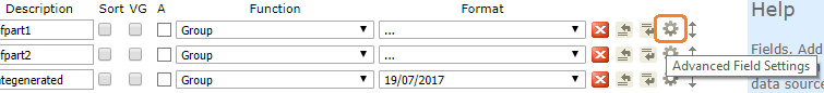
Clicking this will enable you to access further options for your Fields which are worth exploring, all of which are explained on this page.