| Live Search | ||||||||
|---|---|---|---|---|---|---|---|---|
|
Charts
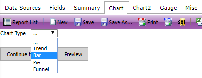
The Chart page is where you are able to add pie charts, bar charts, trend charts, plot charts, and funnel charts to your Report.
For each chart, you need to choose a Label and Value Field.
Label: The Label Field should be chosen based on how you’d like to group your results.
Value: The value Field should be chosen based on what you would like your content of your results to be.
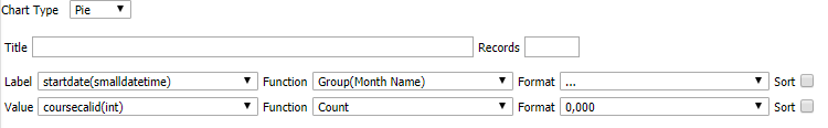
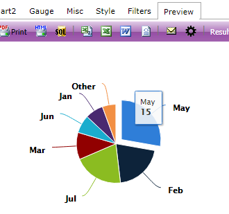
If you wished to compare the number of course dates which you run per month, your label Field would be the course startdate grouped by month name and your value Field would be a count on the course date ids (coursecalid).
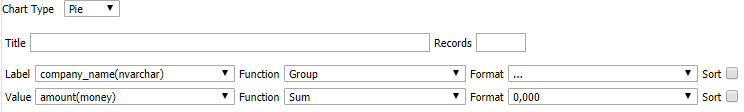
If you wished to produce a graph to show the value of your Invoices by customer, you would need to use the ap_invoices_view and the ap_companies_view, the Account name (company name) to be the label, and the SUM amount of their Invoices to be the value.